Back to Learn

Icon Layout - Creating a Design

Step 1. Prepare Design Assets

If you’ve selected Icon Layout as your Base Design here are some graphics you should prepare before continuing:
  • Logo: Most logos should be created at 700 pixels wide (at 72 dpi). Most important is to save the logo as a .png file so that it is transparent.
  • Home Background (Optional):This one is optional. You can either use a solid fill color, one of our stock backgrounds (NEW), or use your own graphic. If you use your own graphic please keep these in mind:
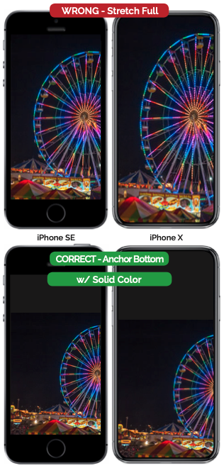
    1. A full-page photo will not stretch well on all phone devices. The iPhoneX and similar Android devices are much taller than the old iPhone lineup and will distort your photo. If wanting to use a photo it is recommended to use one at the bottom or top and fade it to a solid color. This solid color is set in Fonts & Colors -> Home -> Home Page Solid Color.
    2. The best background images are patterns that repeat. If using a repeating background please create the image at 1242 x 2208 and save it at around 900 x 1600 (at 72 dpi). Most backgrounds can be saved as .jpgs instead of .pngs which should cut down on the file size if saved at a lower quality. Because the app will not open until the background image is loaded it is important this file size be as small as possible. Consider using a free service like tinypng.com to reduce the size of your png or jpg graphic as much as possible.

Step 2. Setup Design Elements
App Layout

Once you have your design elements you are ready to combine them into a design. If you switch to a different Base Design at any point you will not lose your progress on setting up Icon Layout. Please note that the preview area does not accurately reflect how it will look on all devices:

  • Logo Image: Upload and choose from the list. Likely leave this centered vertically.
  • Logo Width: You may need to experiment to find the right fit for your logo width. Always assume that someone will use your app on a wider and narrower device.
  • Icons Per Row: Choose 1 to 3.
  • Hide Icon Text: If you include the name in the icon graphic you may want to check this.
  • Rows Per Page: Choose 1 to 4. Scrolling will not happen on the Icon Layout vertically so icons will become smaller the more rows are chosen.
  • Icon Graphic Size: This is a relative measurement if you need to slightly alter the relative size of your icons.
  • Home Background: Upload and choose from the list. Stretching and anchoring are covered in Step 1 above.
  • Top Graphic & Bottom Graphic: If you want to include a stretchable photo image at the top or bottom you could use the Top or Bottom Graphic spot to do so. Image should be 900 wide but unlike the background it may get cutoff if it goes into another section.
  • Search Icon & Side Menu Icon: Required. Use pre-existing graphics or upload your own square .png graphics (250x250 at 72 dpi).
  • Percent of Home Screen Used Per Section: Because the height of the Icon Layout design is locked you can allocate the size of each of the 5 areas that make up the layout.
  • Step 3. Update to the App

    When you are ready to go or just want to test out your progress hit the ‘Update To App’ button in the top right of the Home - Layout & Design page.

    Although the app will refresh itself every two minutes you can speed up the process by exiting the app and coming back into it.

    Layout Publishing Misc

Tutorials & Tips for
Layout, Publishing, Misc

Other Tutorials & Tips